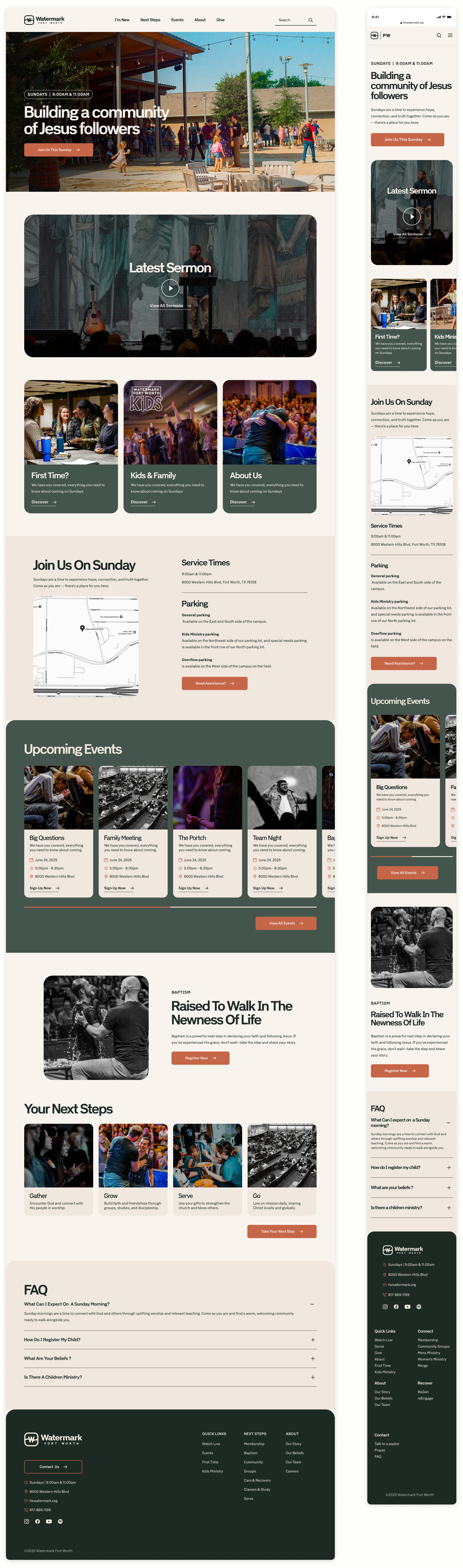
Brand identity, brand book, photography, and website for a Fort Worth church
My Role: Creative direction for the whole brand, from the first interviews to the finished website. I refreshed the logo, created the digital brand book, directed the look, feel, and tone, and redesigned the website.
The original branding didn’t feel ownable, relevant, or usable for the current moment. Watermark Fort Worth needed a brand that looked and sounded like the church it is, welcomed people in from the first click, and worked together everywhere, from the website to Sunday morning and everything in between.

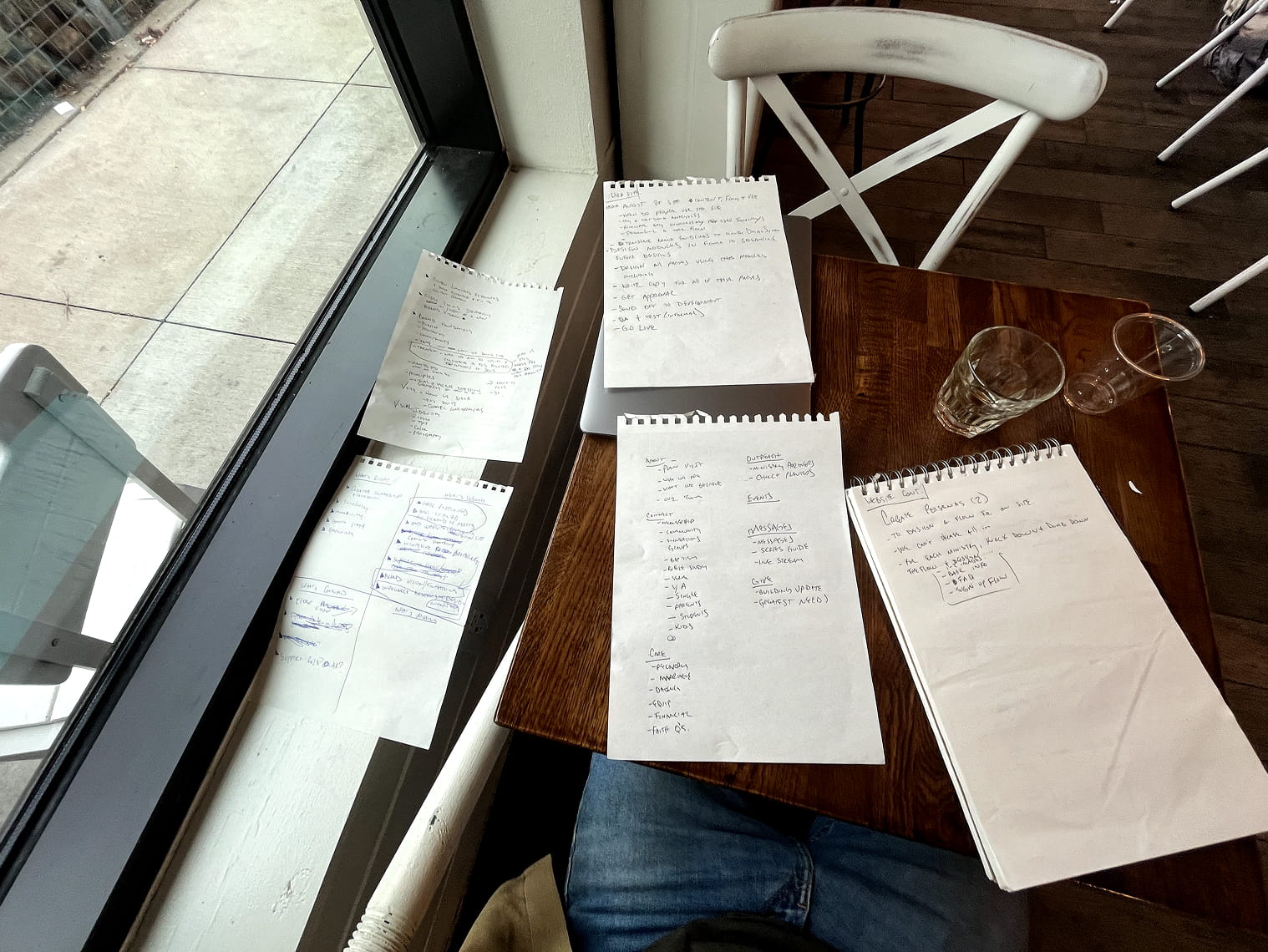
Lots of meetings and internal interviews, then explored color and typography, refreshed the logo, and built a digital brand book that ties together type, color, copy, voice, and photography. A 35mm photoshoot gave the brand its own look, and a full website redesign brought it all to life.
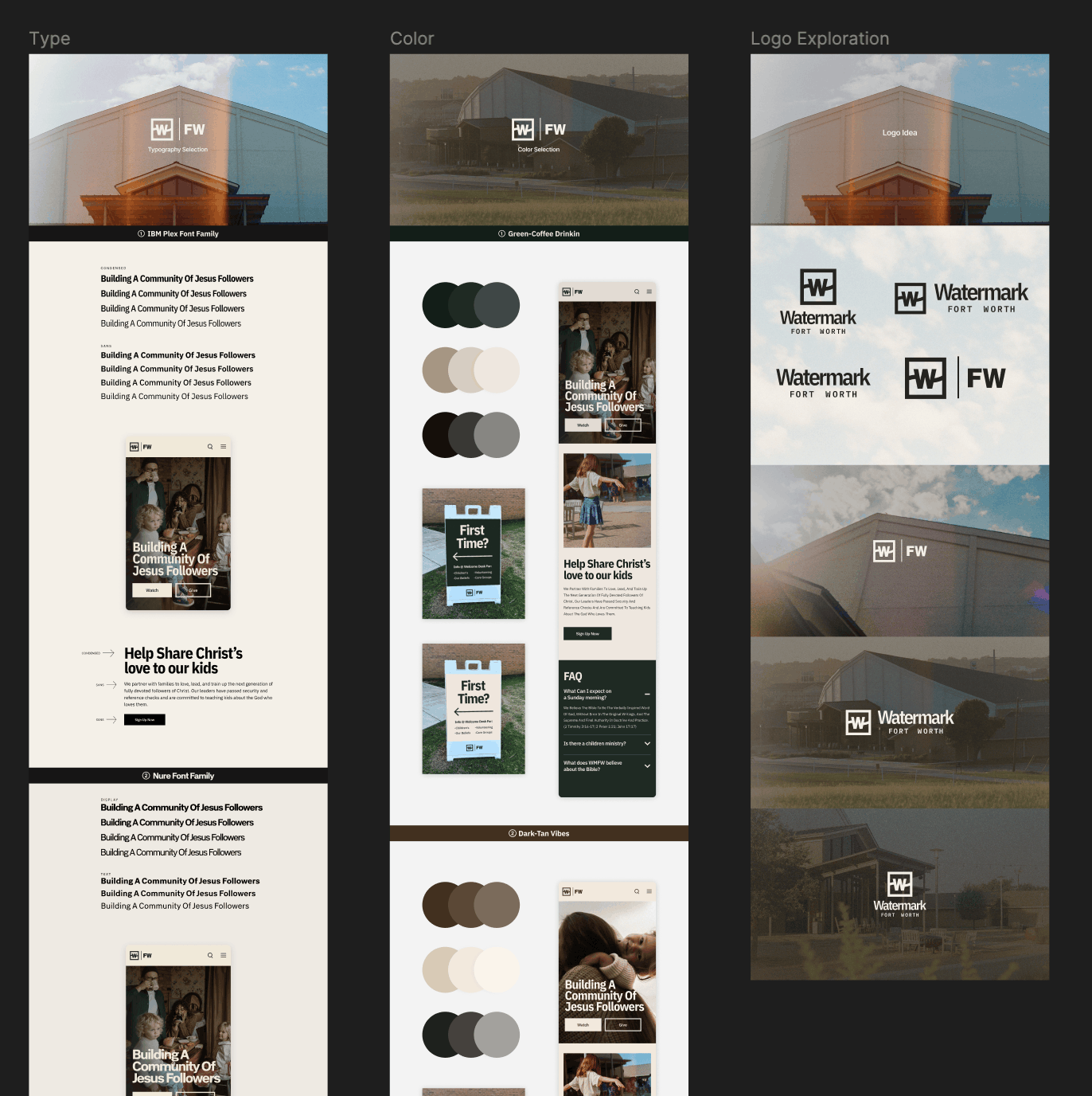





The brand book puts everything in one place: logo, type, color, copy, brand voice, and photography. Because it’s digital, it’s easy to open, share, and keep current as the church grows.
We started by auditing the current site. Then we took everything in the brand book (logo, type, color, copy, voice, and photography) and used it to design the new one.
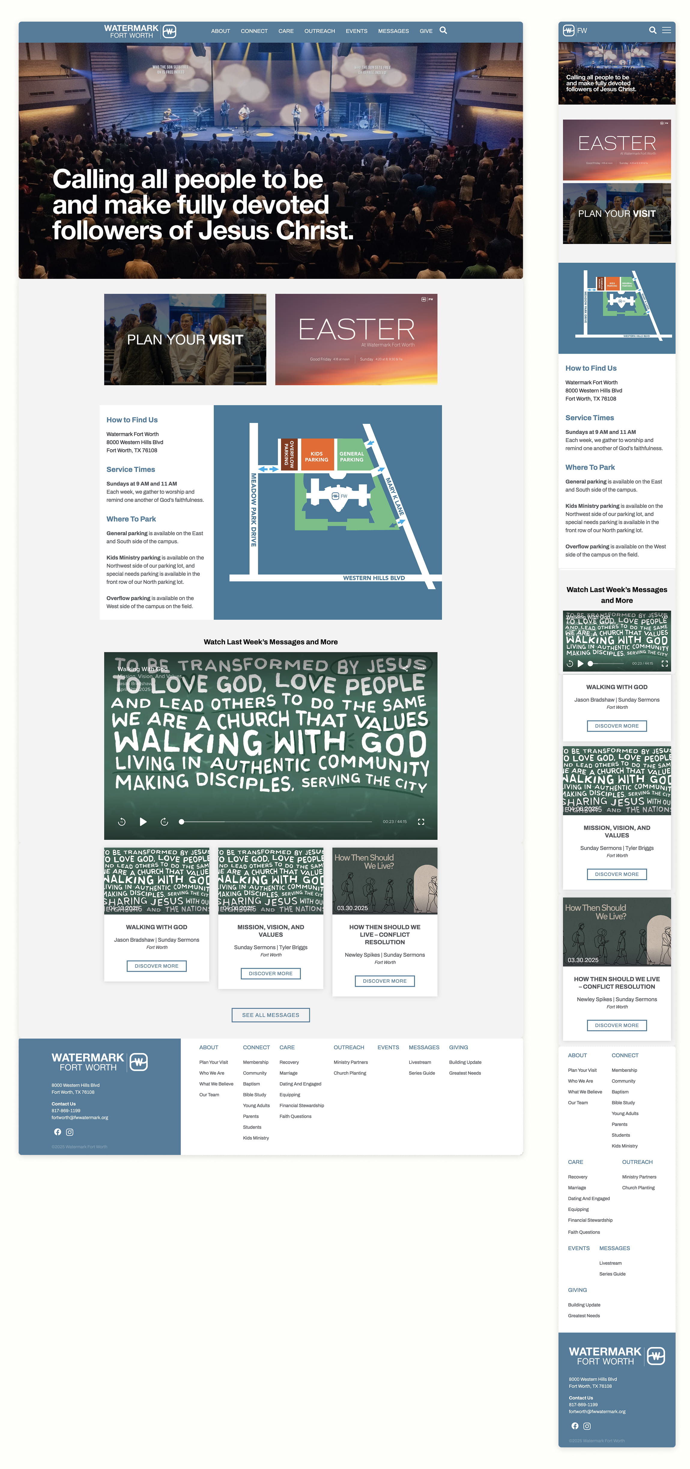
A simple, easy-to-use site with a refreshed look based on the new brand identity, and clear pathways for newcomers and members alike to find what they need.
See the live site→